Brio Aesthetics
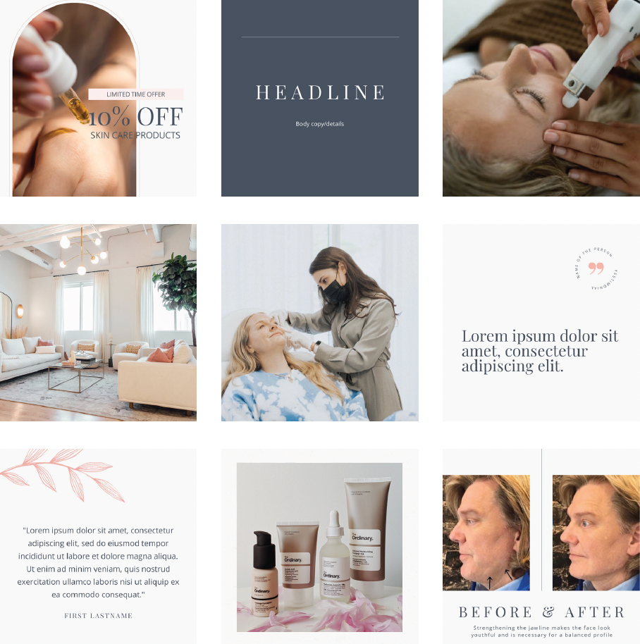
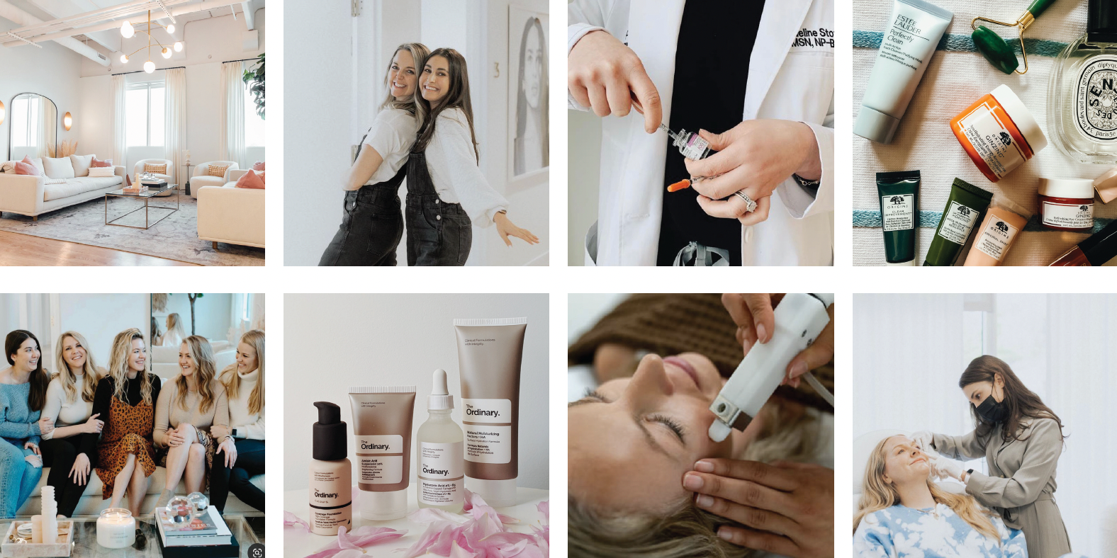
Social Media Templates. The social media grid shows the warm photography working with the digital color palette. The darker tones (greys, navy, and blacks) should be used sparingly. Even the text is never black. Canva templates and standards are setup and should be consistent. However, there should be a balance of graphic layouts and full image blocks to breakup the big picture of the feed.
Photography. The saying, “a picture is worth a thousand words” is no exception here. As you’ll see below, the tones for this brand should be warmer. A subtle natural glow. There are some Lightroom presets provided with the brand package to help with consistency, but all photos should be analyzed and edited for their individual needs.
Regarding the composition of photography, we want to avoid distracting things like purple gloves and off-brand bright colors. The people featured in the photos should seem like they are enjoying the service and relaxed.